A safe space for young people to unite
Creating a supportive community with web design

users in 3 months
97%of young people who’ve seen Lonely Not Alone took positive action and did something to help others
97countries
In 2021 Digital Wonderlab worked with Effervescent to create the Lonely Not Alone Universe; a highly visual interactive website that allowed young people between the ages of 12 and 25 to share their stories of loneliness and create a supportive community in the stars.
The site was designed to stand alone for three months as part of the 2021 Lonely Not Alone campaign, building on the success of the two previous years’ work, yet the success of this campaign has meant that the universe remains live, alongside the community they have created.
Ambition
The Lonely Not Alone initiative was developed to tackle youth loneliness. A campaign designed by young people for young people to address the stigma associated with loneliness and allow young people to talk openly about their experiences.
A Co-op and DCMS funded initiative, Effervescent are the creative design charity, who have worked on the Lonely Not Alone campaign since its inception and approached us to develop the website.
Effervescent are a collective of artists, creatives, qualified youth workers and marketeers, all committed to igniting children’s creativity for good. They help socially minded organisations of all kinds to collaborate with children and young people.
Their ambition in 2021 was to do something bigger and bolder than before. Our brief was to create an engaging website for young people to bring alive their idea of creating a virtual universe, mapped to the real night sky, where young people could share and read stories from others experiencing loneliness.
Co-production and creative design
For the 2021 LNA campaign Effervescent brought together a diverse group of young people from across the UK. Young people were involved at every stage from initial ideation, design and testing in a mixture of workshops and 1:1s. We used Video, Chat and Miro to manage multiple feedback platforms to ensure everyone's voice was heard so we could create an engaging user experience for our young audience.
Through a series of design workshops, we worked with young people and the team at Effervescent to share ideas on how the universe could look and feel, and how we could use technology to bring their ideas to fruition.
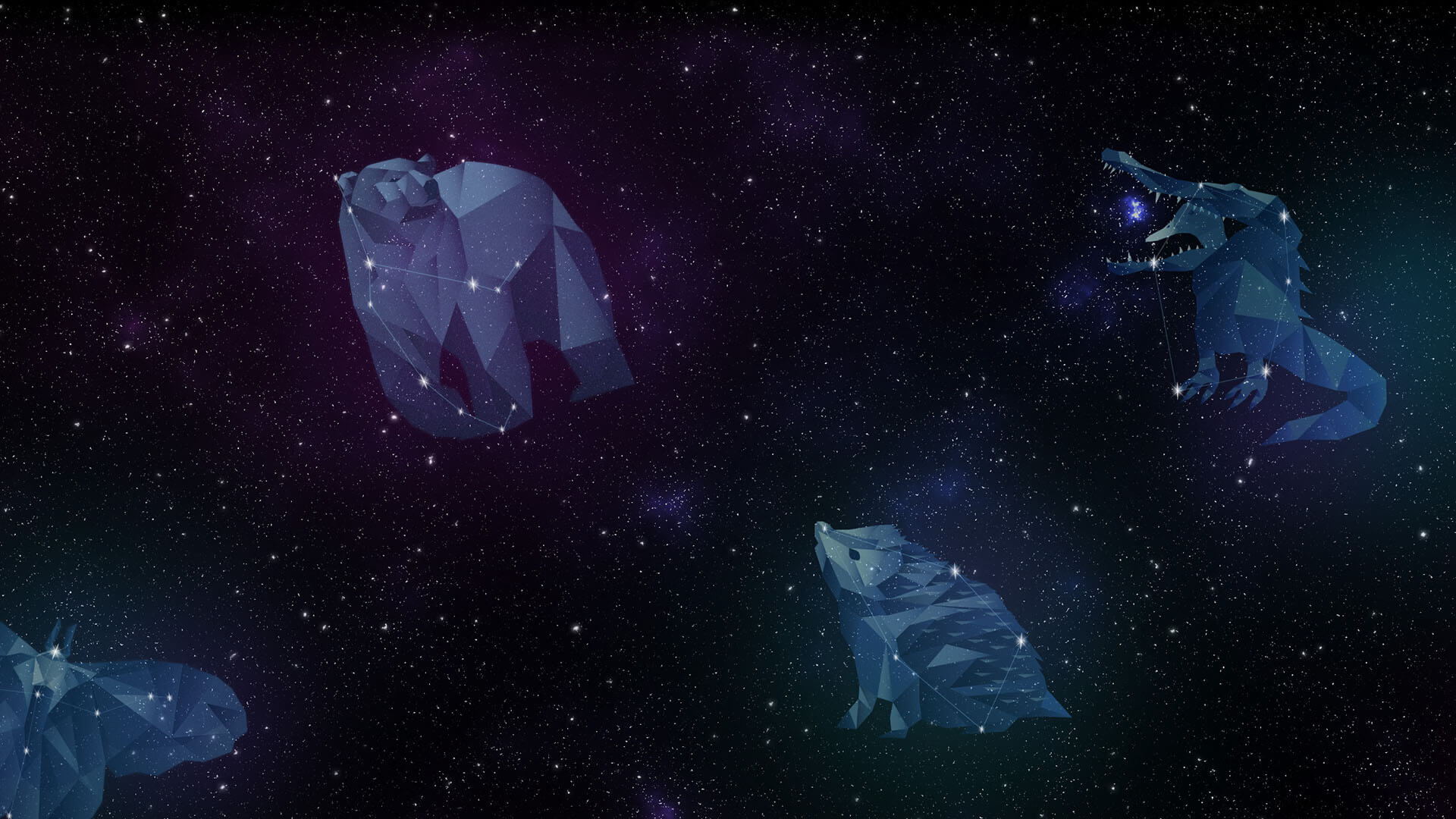
The idea was that each story shared by a young person would be assigned to a star and each star would then be placed within an imagined animal constellation. The 8 animal constellations were created to represent different challenges that young people might face that has led to their loneliness. Each imagined constellation needed to be reflected in real life constellations so that if a young person looks up at the sky at night they can see their star and know that they are not alone.
We started to experiment and play with designs, using a mixture of 2D drawings, to bring to life the constellation animals imagined by the team. We then mapped the creations onto the real-life constellations, such as the great bear to create a sky full of animal constellations filled with stars.
After the design phase we focussed on the functionality of the site and managing the campaign. Knowing the audience would be almost exclusively on mobile we employed all mobile design standards to ensure navigation was simple whilst remaining a highly immersive experience, using the native microphone to allow people to record stories.
Accessibility and inclusivity
Each story submitted was read by the team at Effervescent before they were uploaded to the site, this was to ensure that they could safeguard and prevent anyone from posting anything inappropriate. We created an admin system which allowed the team to read and assign to the right constellation and manage any under/over age submissions.
Loneliness by its nature is exclusive, and whilst we had a strong remit to create something immersive and engaging, everyone wanted to ensure that the campaign was accessible to all. So, we created an alternative site, that shared the same content, allowing people to engage with an easy read, high contrast and screen reader friendly version.
The joy of working with Effervescent is that they are creative, full of ideas and energy and know how to let young people speak their truth. We were working with tight budgets and tight deadlines, yet we delivered the project in eight weeks, a brilliant mix of creativity, craft and collaboration.
The Co-op Foundation lead the supporting PR and social media campaign and conducted the evaluation. A true collaboration of young people, creatives, techies and change makers.
- Umbraco CMS
- Bootstrap framework
- TelBee's recording software
The tech behind the campaign
For the core content management we utilised Umbraco CMS, a feature rich and easy to manage website platform.
The frontend of the website is built using a Bootstrap framework.
We integrated TelBee's recording software to enable seamless recordings.
Related case studies

Scaling global businesses through people intelligence data
- User experience

Going paperless: Streamlining efficiency and real-time insights
- User experience

Putting a smile on children's faces
- Strategy

A child-centred virtual learning environment
- App

Award-winning UX for commercial success
- User experience

Revolutionising e-learning through gamification
- User experience

Reinventing recruitment with transformative technology
- Strategy

A safe space for young people to unite
- User experience

Bringing Tibetan mediation practices to the people
- User experience